Bitcoin charts are similar to the 2021 top: Will history rhyme?

Bitcoin’s price chart is starting to mimic the pattern it displayed when it reached the previous cycle’s all-time high of $69,000 in November 2021, according to a crypto trader.
Other traders argued that charts don’t tell the full story now, amid mounting demand for Bitcoin from crypto treasury companies.
Bitcoin charts look similar to 2021, trader says
Technical analysts often compare Bitcoin’s price chart to similar patterns in past cycles to figure out when the price might peak, when to sell and when money may start rotating into other assets.
“Has anyone else noticed that the topping price action in 2021 looks exactly the same as current price action?” crypto trader Nebraskangooner said in an X post on Thursday, pointing to a chart showing what appeared to be a double top pattern often viewed by traders as bearish.
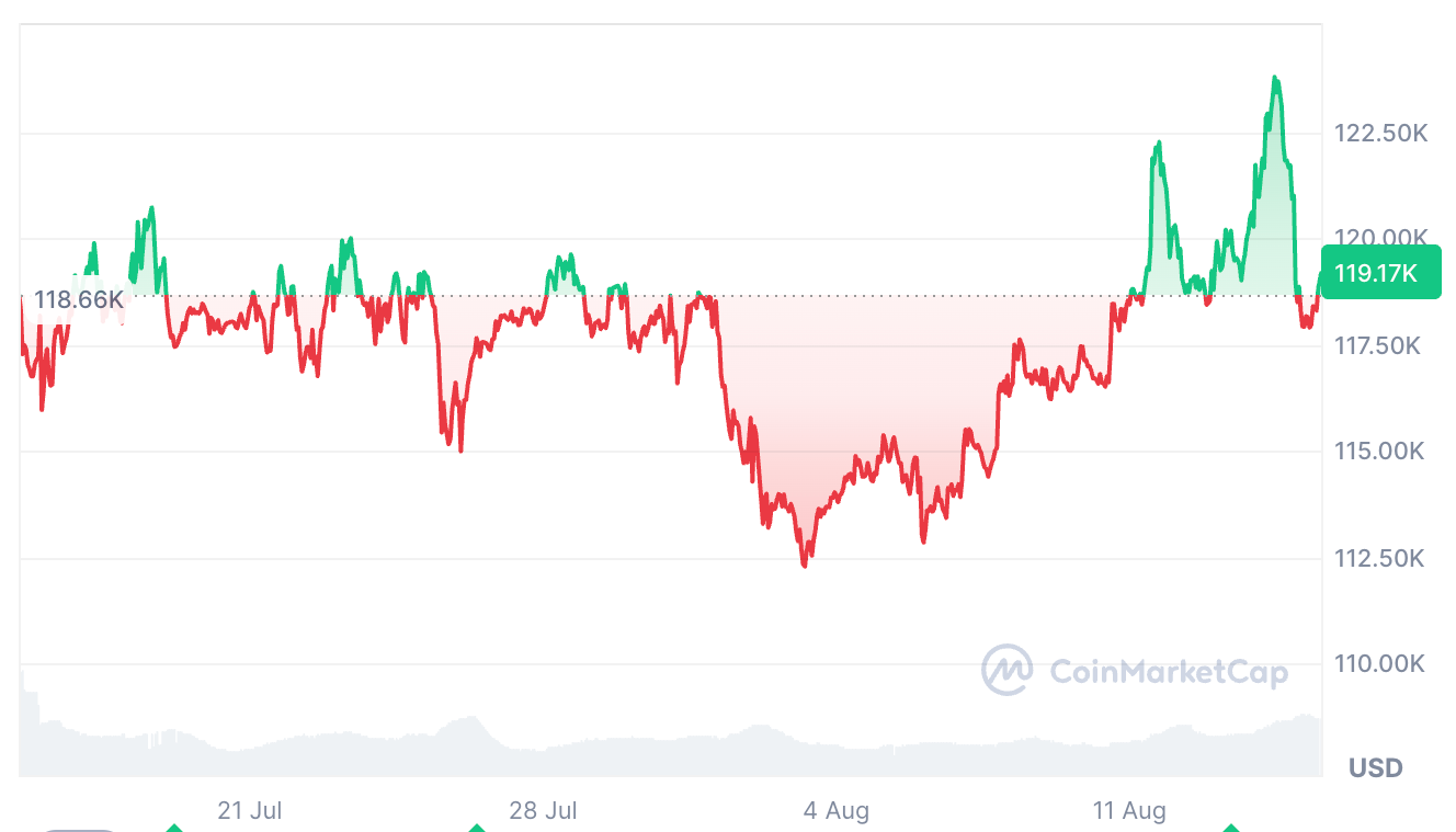 Bitcoin has fallen 4.3% over the past 24 hours, after reaching a new all-time high of $124,100 on Thursday. Source: CoinMarketCap
Crypto analyst Benjamin Cowen agreed, suggesting that the Bitcoin chart tracks the same pattern each post-halving year.
“Up in July-Aug. Down in Sep. Up into the market cycle top in Q4. Bear Market,” he said.
Traders using charts to predict prices are “fooling themselves”
Still, crypto trader Kale Abe said Nebraskangooner’s observation was “another instance where charts and fractals don’t matter.”
“The only thing that matters is the treasury companies and if they are out of ammo or not,” Kale Abe said. BitcoinTreasuries.Net data shows that $150.98 billion worth of Bitcoin has been scooped up by publicly traded Bitcoin treasury companies.
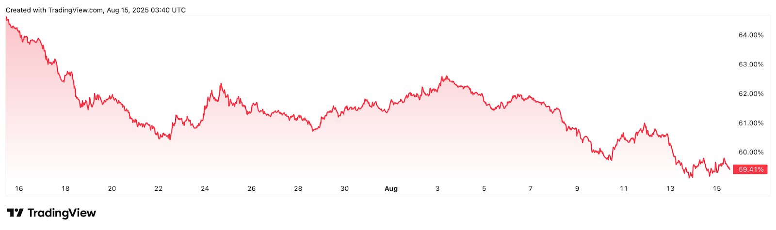 Bitcoin dominance, which measures Bitcoin’s overall market share, fell 6.55% over the past 30 days. Source: TradingView
Abe also doubted that Bitcoin would go “into a bear market” as Ether is nearing its all-time highs. “Impossible,” he said. Ether is up 19% over the past seven days, trading at $4,612, about 5.75% below its 2021 all-time highs of $4,878.
It comes just a few weeks after veteran trader Peter Brandt told Cointelegraph Magazine , “Anyone that looks at the charts and tries to tell you where anything is going is actually just kind of fooling themselves.”
Brandt said the only real use of a price chart is seeing where the price has been and where it is now.
Disclaimer: The content of this article solely reflects the author's opinion and does not represent the platform in any capacity. This article is not intended to serve as a reference for making investment decisions.
You may also like
ETFs are being launched in clusters, but coin prices are falling. Can ETF approval still be considered good news?
On one hand, Vanguard has opened Bitcoin ETF trading, while on the other hand, CoinShares has withdrawn its applications for XRP, Solana Staking, and Litecoin ETFs, highlighting a significant divergence in institutional attitudes toward ETFs for different cryptocurrencies.

ADP employment data "unexpectedly weak", is a Federal Reserve rate cut imminent?
Glassnode Report: Current Structure Strikingly Similar to Pre-Crash 2022, Beware of a Key Range!

Coinglass report interprets Bitcoin's "life-or-death line": 96K becomes the battleground between bulls and bears—Is the ETF capital withdrawal an opportunity or a trap?
Bitcoin's price remains stable above the real market mean, but the market structure is similar to Q1 2022, with 25% of supply currently at a loss. The key support range is between $96.1K and $106K; breaking below this range will increase downside risk. ETF capital flows are negative, demand in both spot and derivatives markets is weakening, and volatility in the options market is underestimated. Summary generated by Mars AI. The accuracy and completeness of this summary are still being iteratively updated by the Mars AI model.